

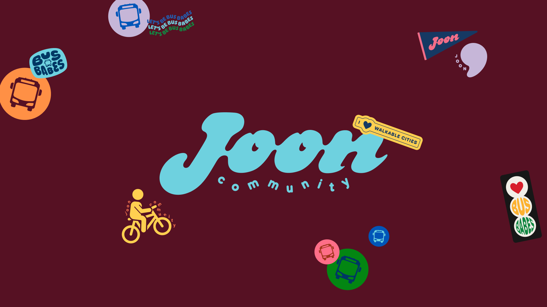
Joon Community
Joon Community is a public transit-focused and mutual aid non-profit based in Twin Cities, MN that promotes environmental justice and hosts community-centered events worldwide.
Previously operating as Sustain the Mag, Joon Community went through a rebrand after officially being registered as a 501(c)3 and tapped in LARO Studio for a visual identity for both the main brand, and their event series Bus Babes.
Custom type logo
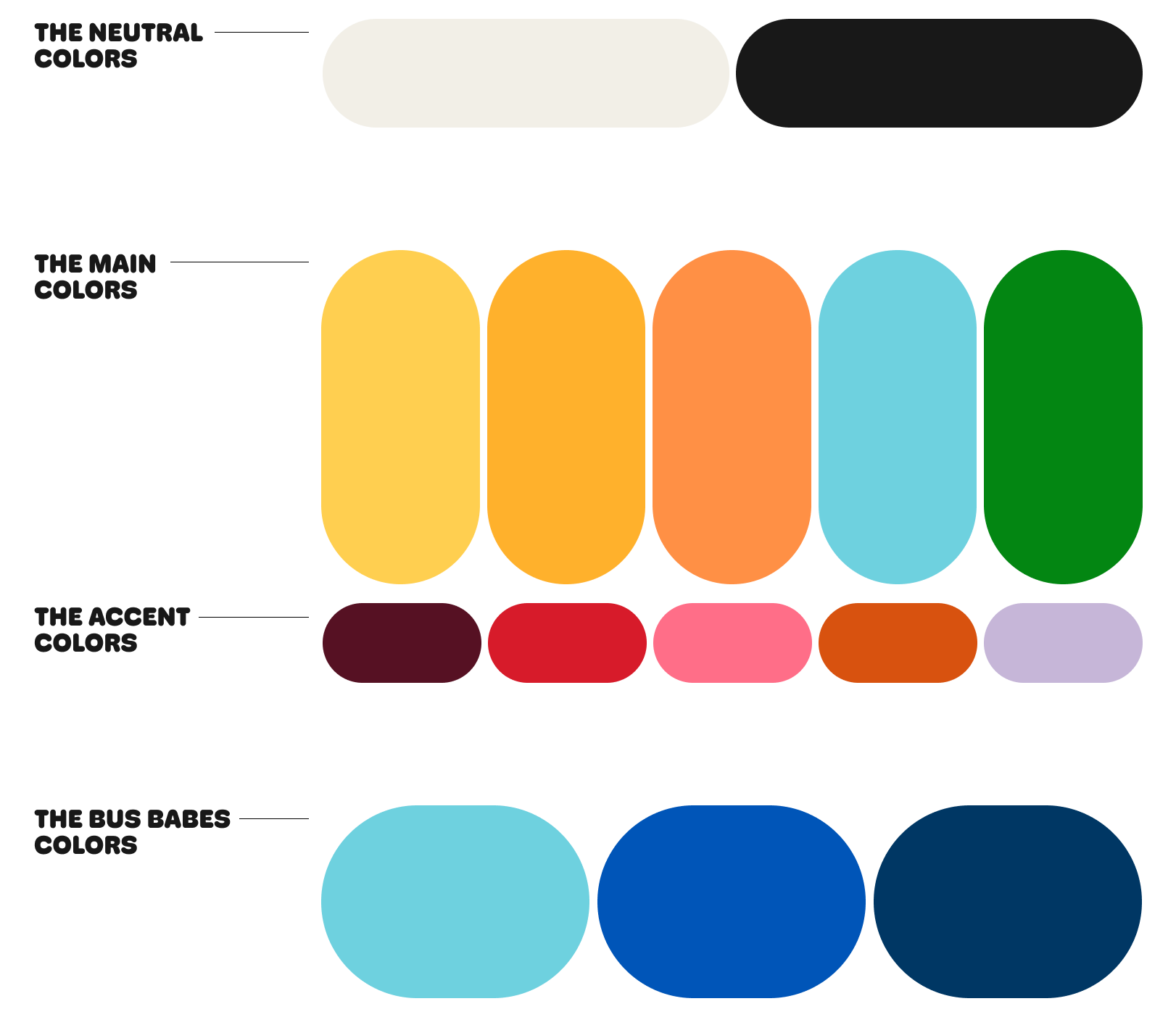
The overall Joon Community vibe is friendly and approachable, largely reaching out to local communities to be involved in their events. Visually, that translated to rounded forms on a chunky custom drawn wordmark.

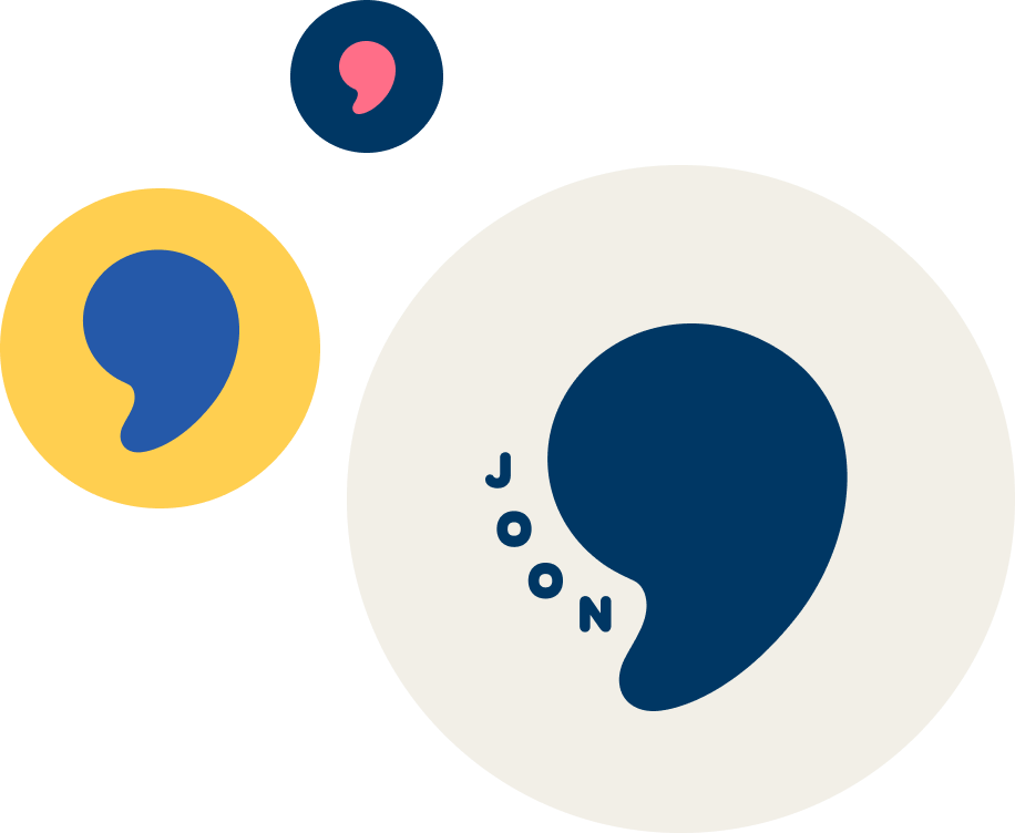
A submark with cultural meaning
The founder, Reza, who is of Persian descent, told us about the word joon roughly translating to the term of endearment dear, turning the brand name into “dear community”. This brought to mind the other use of the word dear as a salutation at the beginning of a letter — Dear community, — leading to the comma submark, crafted from the shape of the J in the main logo.
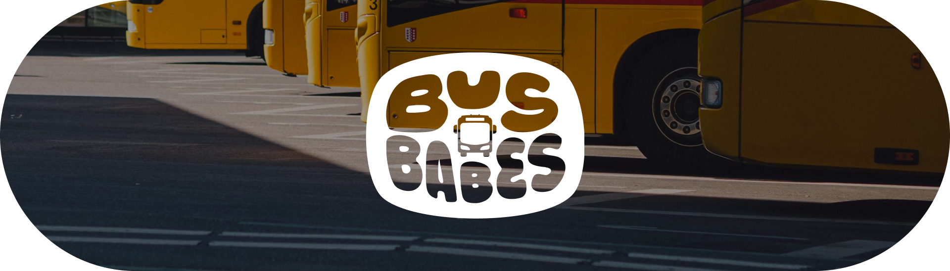

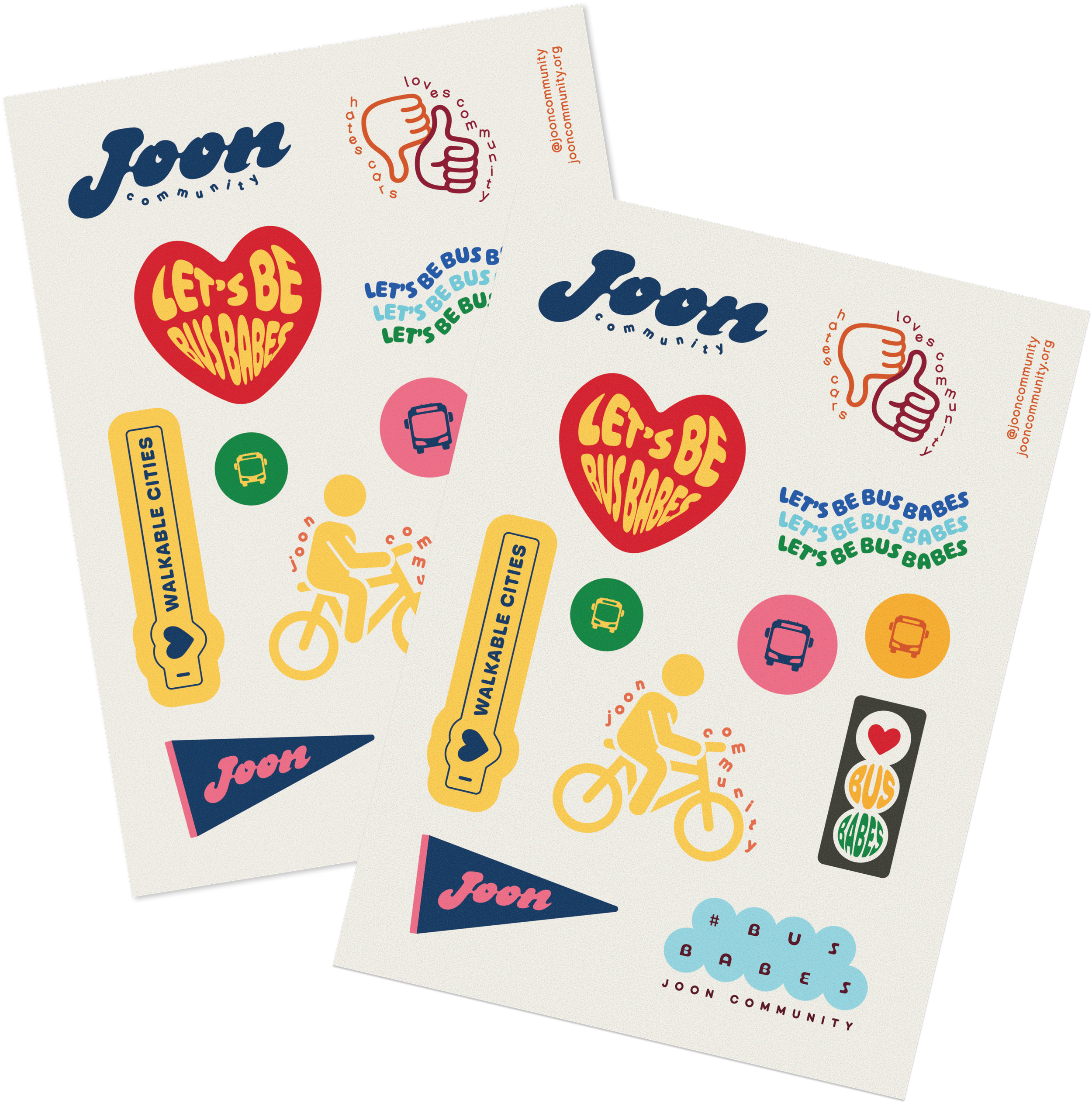
Bus Babes Sub-brand
Joon Community hosts city tours on public transit in partnership with CapMetro in Austin, Texas, with plans to expand into Denver, Twin Cities, Rhode Island, Los Angeles, and more. The icon for this sub-brand was made to stand on its own, but also with plans in mind to make it into a sticker, badge, or patch.
The Bus Babes sub-brand was made in collaboration with Emma Steinhobel.

Credits
LARO Studio —
Creative direction, design: Paulina Laroya
Design (Bus Babes + sticker sheet): Emma Steinhobel