All in the Cards
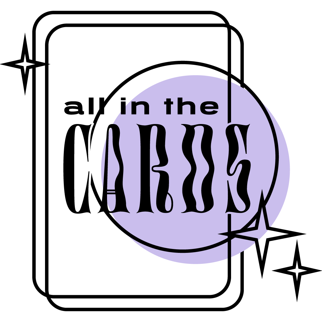
All in the Cards is a weekly tarotscope and astrology forecast newsletter by Kristina Bornholtz.
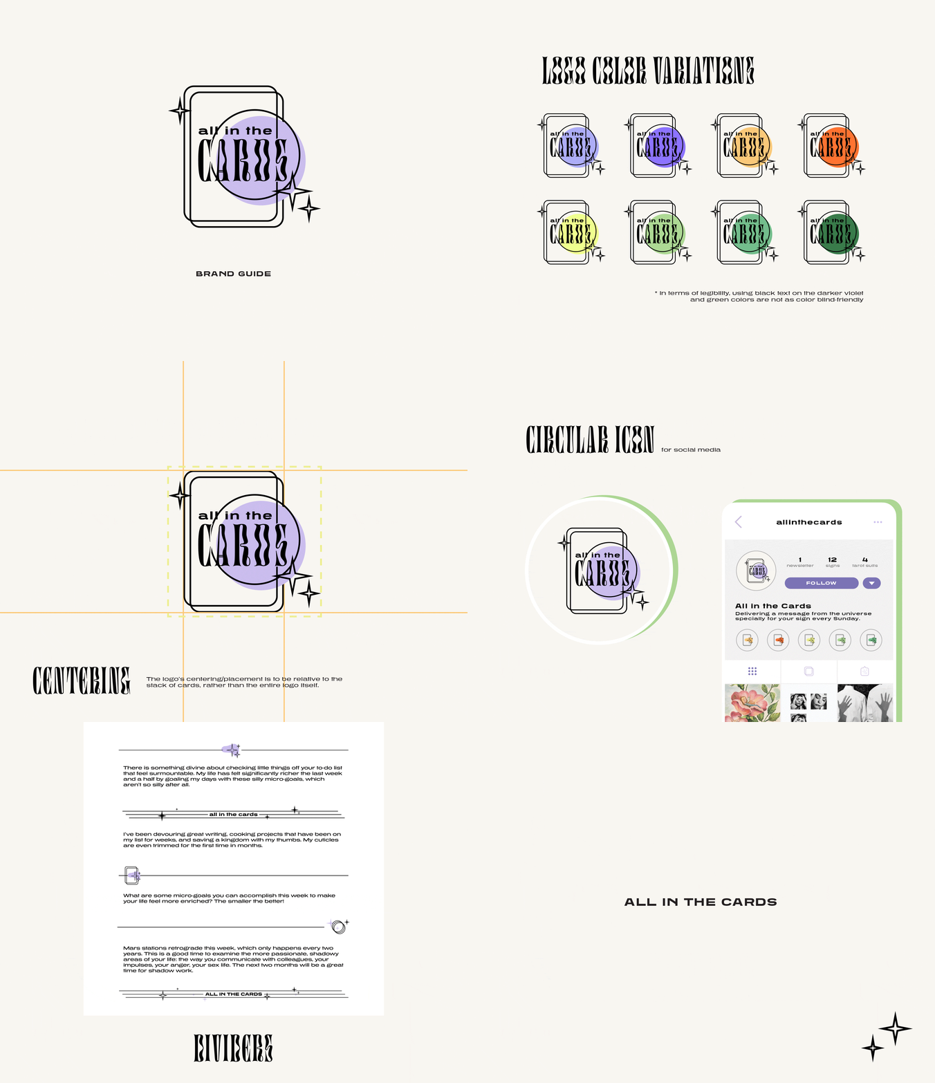
This extra fun brand was sort of an in-between of our mini brand and standard brand package. It started with a simple yet unique miscellaneous items, and there were only two specific requests: use the Digestive typeface by OHNO Type Co (our client was ahead of the times — this was before the typeface got super popular!) and use lilac as the main logo color.
The stacked look on the logo and used on other elements hinted at tarot cards and played on the name of Substack, the platform used for the newsletter.
Highlight — iconography
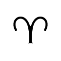
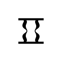
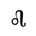
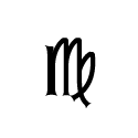
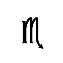
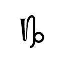
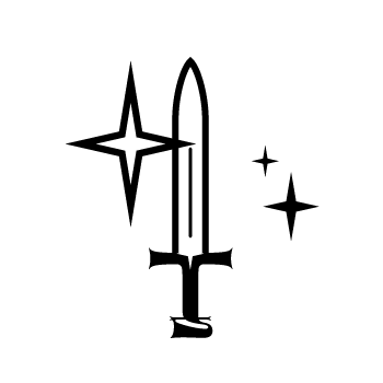
Custom zodiac signs and tarot suits were crafted from stylistic elements from letters and other glyphs from the main brand font.
“[The project process] met and exceeded expectations. You gave me a great deal of information to work with in the style guide so I’ve felt comfortable enough to continue doing work with the assets, fonts, and color guide as the brand has grown and shifted over the last few months.”


