

How to add a gradient to the Squarespace moving orb effect

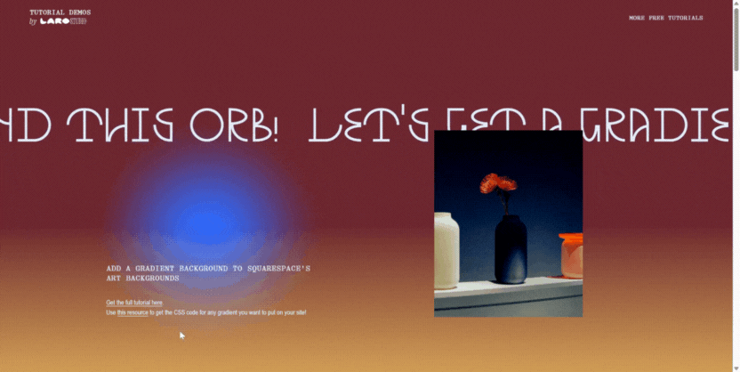
Squarespace has this really cool feature where you can easily add in a gradient orb that follows around your mouse cursor. A lot of clients really love it because — well, it’s a vibe! — and I love it because all its customization features allows it to adapt to so many different visual styles.
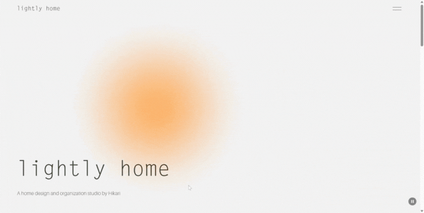
One problem though: it replaces the native option to add a gradient background so if you want that little orb AND a gradient background, you can't do it with native Squarespace settings.
Luckily, I figured out some code that will let you add a gradient to this moving orb!
Follow the tutorial below and see the code in action on the Demo Site ↗
Follow the steps below to make this gradient + orb combo!
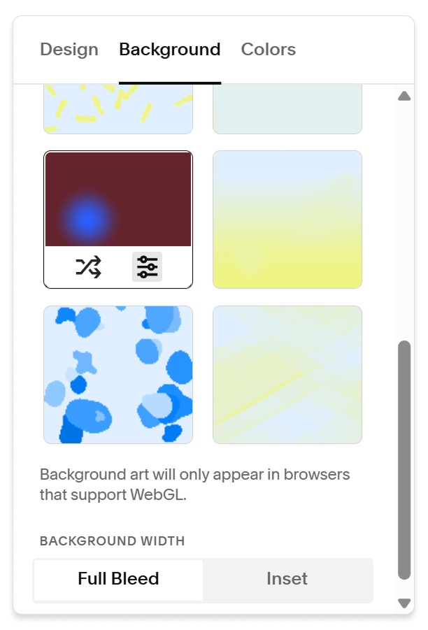
Step 1
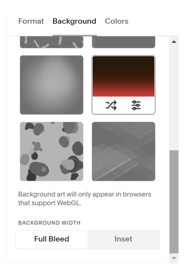
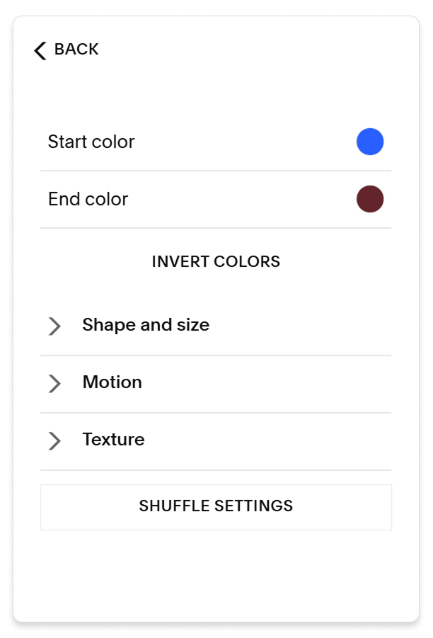
Apply the gradient orb to your section and change around the settings to your desired colors, orb size/shape, noise, etc.
For this example, I used #2A5FFF for the orb and #64242B for the background. The background will end up looking like part of your gradient.
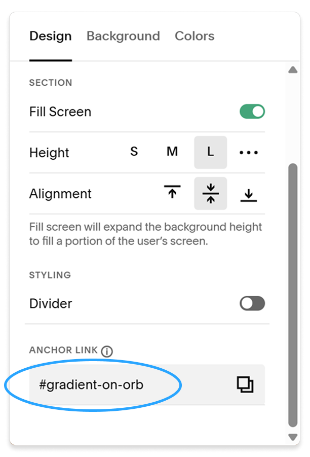
Step 2
Go to the Design tab and type “gradient-on-orb” into the Anchor Link field.
*If you’re already using this field for something else, just leave what you have! You’ll just need to make a quick edit to line 1 of the CSS code below so the names match.
Step 3
Copy the code below and paste it into your site’s Custom CSS
#gradient-on-orb .content-wrapper{
  background: linear-gradient(180deg,rgba(255, 201, 94, 0) 50%, rgba(255, 201, 94, 1) 100%);
  position: absolute;
  top: 0px;
  left: 0px;
  height: 100%;
  width: 100% !important;
  max-width: 100vw;
  padding: 0px !important;
  overflow-x: hidden;
  align-items: center;
}
Then click Save! More on how to choose your own gradient colors on Line 2 below.
If you are using the classic editor (not fluid), see below for additional lines of code to fix margins.
If your gradient didn’t appear immediately, refresh the page.
Okay, let’s break down these lines of code so you can edit them to your liking!
If you're using an anchor link/section ID (as mentioned in Step 2) other than #gradient-on-orb, change this to the anchor link you're using (but make sure to keep the # symbol!)
This gradient goes from a fully opaque #FFC95E (a nice dandelion/gold color) on the bottom to a transparent version of the same color on top. I use this CSS gradient generator to copy-paste the code for gradients, which also lets you change the angle and even use a radial gradient!
Just remember that this gradient will be layered on top of the Squarespace art background, so you’ll need some transparency in your gradient code so the orb can still be visible. Play around with the color value of the transparent part to see which gives a smoother blend (it makes a difference!).
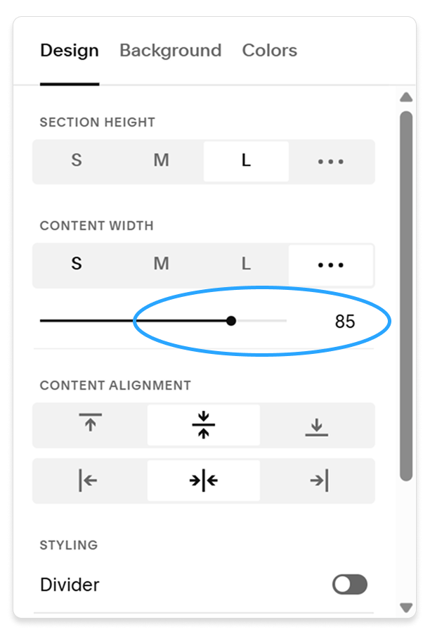
The left, width, max-width, and padding lines also prevent this div from getting too wide, resulting in an annoying horizontal scroll bar appearing on your site. Play around with these values to see what they do!
Fixing the margin on the Classic Editor
If you opt to use the classic editor for this (which is still my preference over the fluid sections in most cases!) you may encounter the side padding being completely removed from the section content. This can be easily adjusted by changing the Content Width setting.
More gradient inspo!
Just for fun, let’s play around with more ways we can change up the gradient. You can see all of these on the demo!
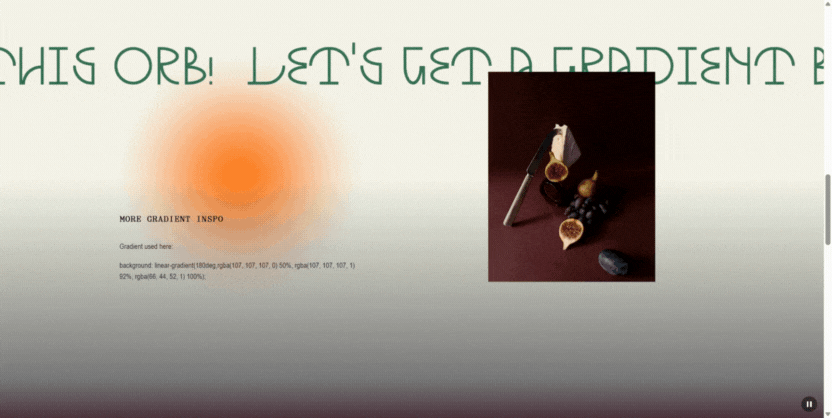
This one adds a third color at the very bottom of the gradient to add a nice bit of contrast in a subtle way.
background: linear-gradient(180deg,rgba(107, 107, 107, 0) 50%, rgba(107, 107, 107, 1) 92%, rgba(66, 44, 52, 1) 100%);
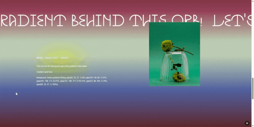
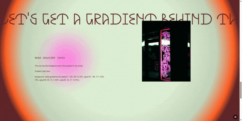
On this one, the transparent part of the gradient is in the middle of the gradient.
When doing this, I recommend matching the color of the transparent stop of the gradient to the color of the main background.
background: linear-gradient(180deg,rgba(85, 35, 37, 1) 0%, rgba(141, 58, 80, 1) 21%, rgba(181, 199, 171, 0) 41%, rgba(181, 199, 171, 0.14) 51%, rgba(73, 88, 150, 1) 74%, rgba(85, 35, 37, 1) 100%);
A radial gradient can also make a really cool halo effect around a page section.
background: radial-gradient(circle,rgba(217, 236, 206, 0) 45%, rgba(181, 199, 171, 0.85) 70%, rgba(255, 85, 33, 1) 82%, rgba(85, 35, 37, 1) 87%);
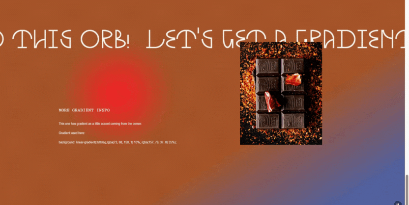
This is a nice way to have the gradient be a more subtle accent as a little design touch on the bottom corner.
background: linear-gradient(328deg,rgba(73, 88, 150, 1) 10%, rgba(157, 76, 37, 0) 35%);
If you end up using this trick on your website, let me know. I’d love to see how you got creative with your gradients!
If you want to stay updated on more tutorials or recommend future ones, join the email list for code/web tutorials: