

How to Stylize a left-aligned Mobile Menu on Squarespace
One great thing about Squarespace is that it automatically creates a mobile-friendly navigation menu. And design-wise, it’s good to go — it uses the fonts and colors you set for your website, it’s center-aligned, and it’s clean.
But if you want to change it up a little, there are a few simple things you can do with code. Here’s what I did on the LARO Studio site to make it a bit more stylized to the brand look; no gatekeeping here, you can copy and paste the CSS below!
Edit as of July 19, 2026: Recently, Squarespace changed the native code to the navigation links preventing the image/symbol for the active page to appear all the way to the right of the screen. A few lines have been added to the end of the codes below to fix this.
Copy the code below and paste it into your Squarespace site’s CSS. Replace anything in all caps with your own style values!
.header-menu-nav-item{
  border-bottom: thin solid #HEXCODE;
  text-align: left;
  a{font-size: 2.5em;}
  &:first-child{border-top: thin solid #HEXCODE;}
}
If you want to change the font of the navigation links, add this line to the .header-menu-nav-item selector:
font-family: "FONTNAMEHERE";
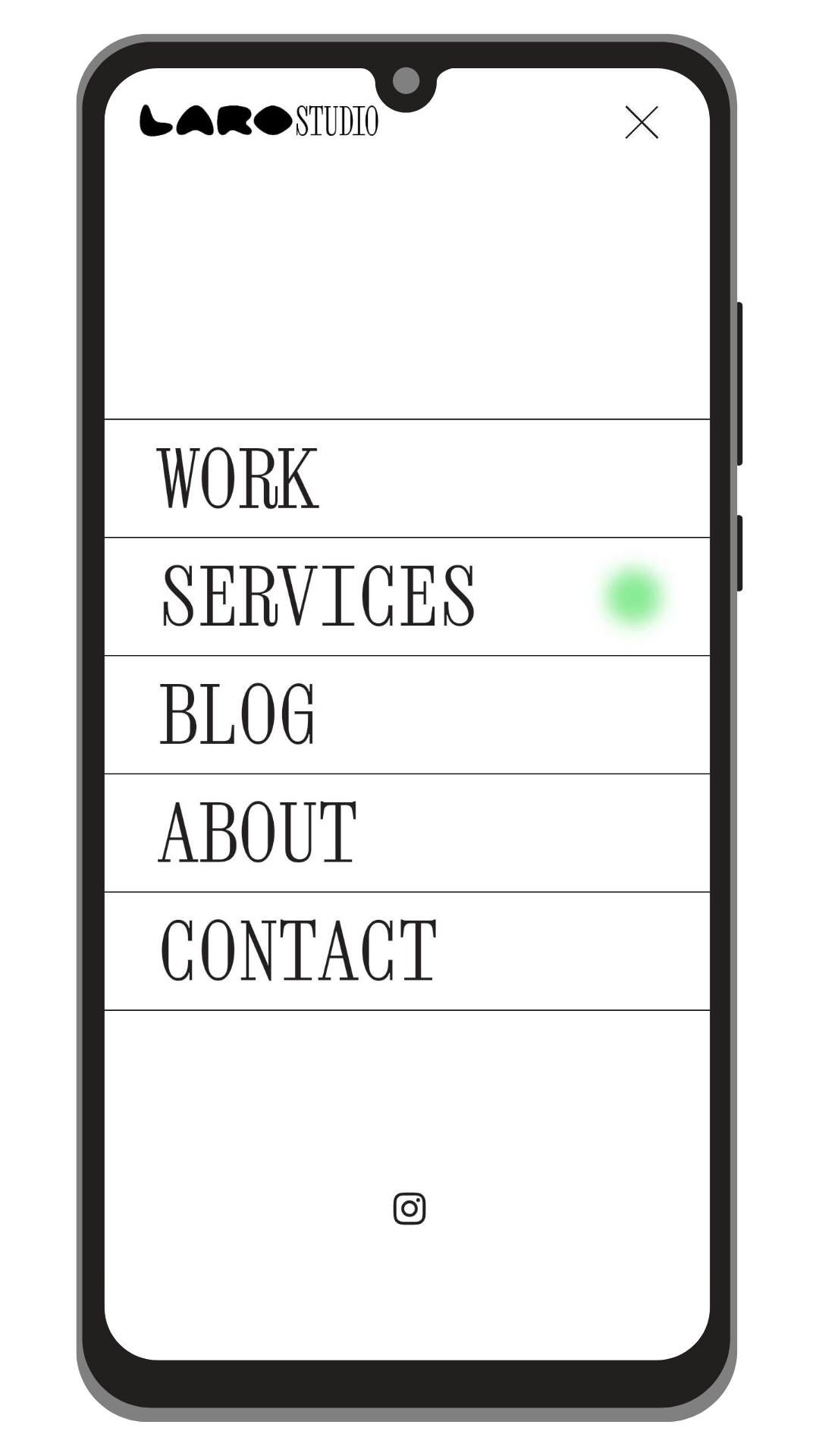
The default Squarespace styling adds an underline to the link of the current active page (the webpage that the visitor is currently on), but I replaced it here with a green orb using this code:
:is([aria-current="page"], [aria-current="true"]) .header-menu-nav-item-content{
  background-image: none;
  &:after{
    content: '';
    float: right;
    background-color: #HEXCODE;
    filter: blur(6px);
    width: 34px;
    height: 34px;
    border-radius: 100px;
  }
  display: flex;
  justify-content: space-between;
  align-items: center;
  width: 100%;
}

.header-menu-nav-item--active a{
  width: ~'calc(100% - 10vw)';
}
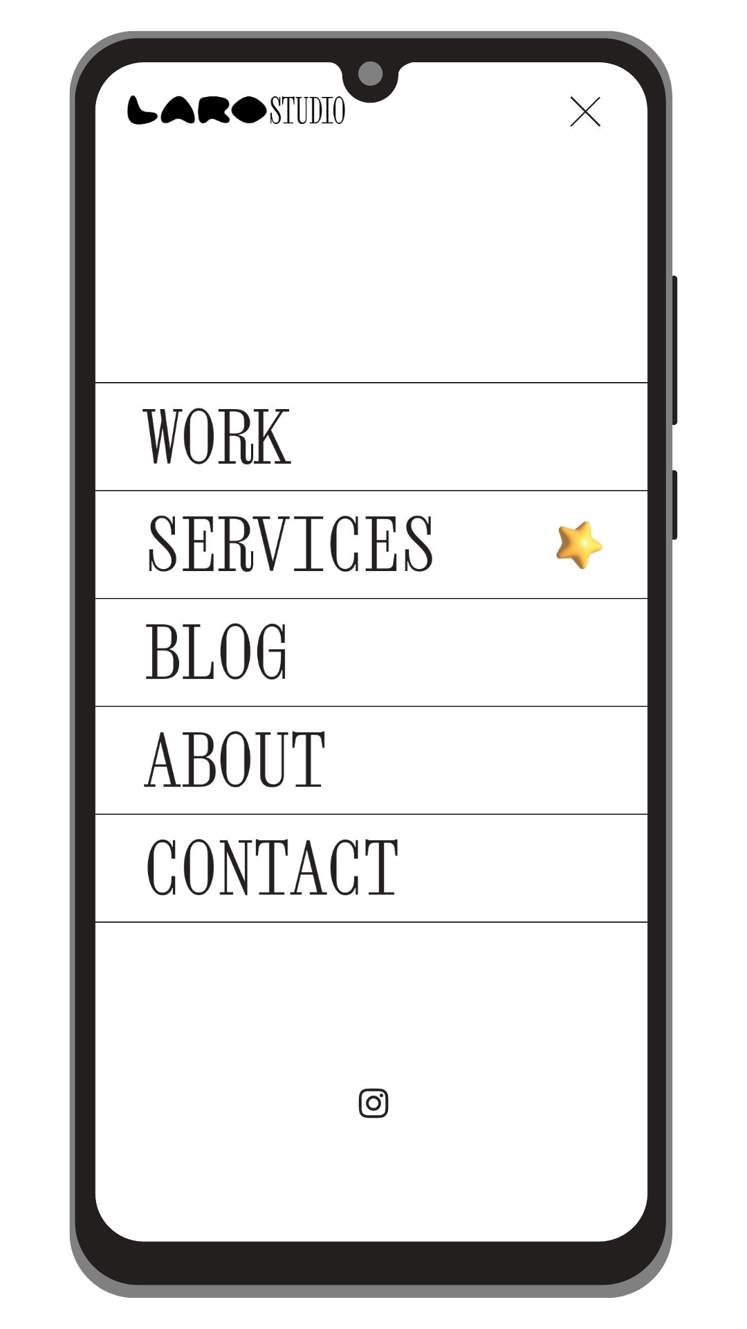
If you want to use an image in the place of the orb, use this code snippet instead! If you’re using an icon that you have a vector of, use an SVG instead of a PNG so it shows as crisp and clear as possible ✨
:is([aria-current="page"], [aria-current="true"]) .header-menu-nav-item-content{
  background-image: none;
  &:after{
    content: '';
    float: right;
    background-image: url('IMAGEURLHERE');
    background-size: contain;
    background-repeat: no-repeat;
    background-position: center;
    width: 34px;
    height: 34px;
  }
  display: flex;
  justify-content: space-between;
  align-items: center;
  width: 100%;
}

.header-menu-nav-item--active a{
  width: ~'calc(100% - 10vw)';
}
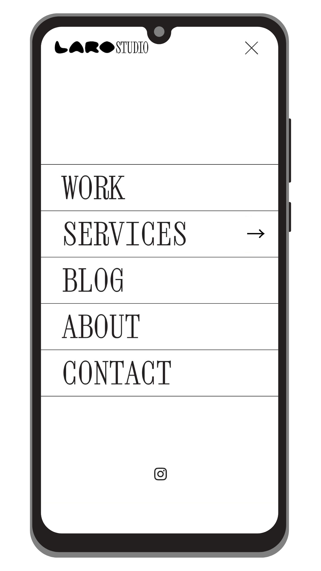
Or an even simpler option — you can use a text symbol or emoji instead! Just replace the text on the content: ' '; CSS line.
:is([aria-current="page"], [aria-current="true"]) .header-menu-nav-item-content{
  background-image: none;
  &:after{
    content: '→';
    float: right;
    font-family: "FONTNAMEHERE";
  }
  display: flex;
  justify-content: space-between;
  align-items: center;
  width: 100%;
}
This is styled like any text, you can add any CSS text styling to format the text and drop it into the &:after selector!
If you learned something from this tutorial and used it on a website, let me know! You can also tag @larostudio.co on Instagram to show off your work 🤩