

Behind the backBIPOC brand and web refresh
In 2024, my very first Squarespace website, (which was featured by Squarespace themselves!) made a re-debut with a refreshed look. This one was a long time coming — I wanted to launch this redesign in 2023, but wanted to make sure I was 100% sold on all the elements of the website, and not just forcing a design or layout because I felt like I needed to.
There was a lot of intention behind the design choices I made and in the end, I’m super proud of how it came out. Read on to learn more about my thought process behind some of the main changes made from backBIPOC 1.0 to backBIPOC 2.0!
The “Classics”
Off the bat, there were things I knew for sure I wanted to keep from the original look: the homepage’s above the fold section, and the categories section right below it.
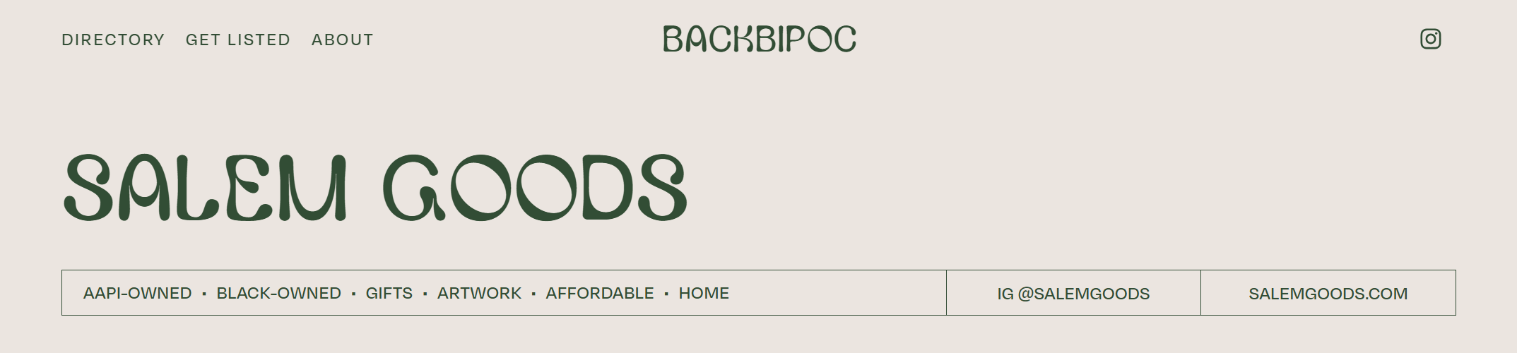
Above the fold
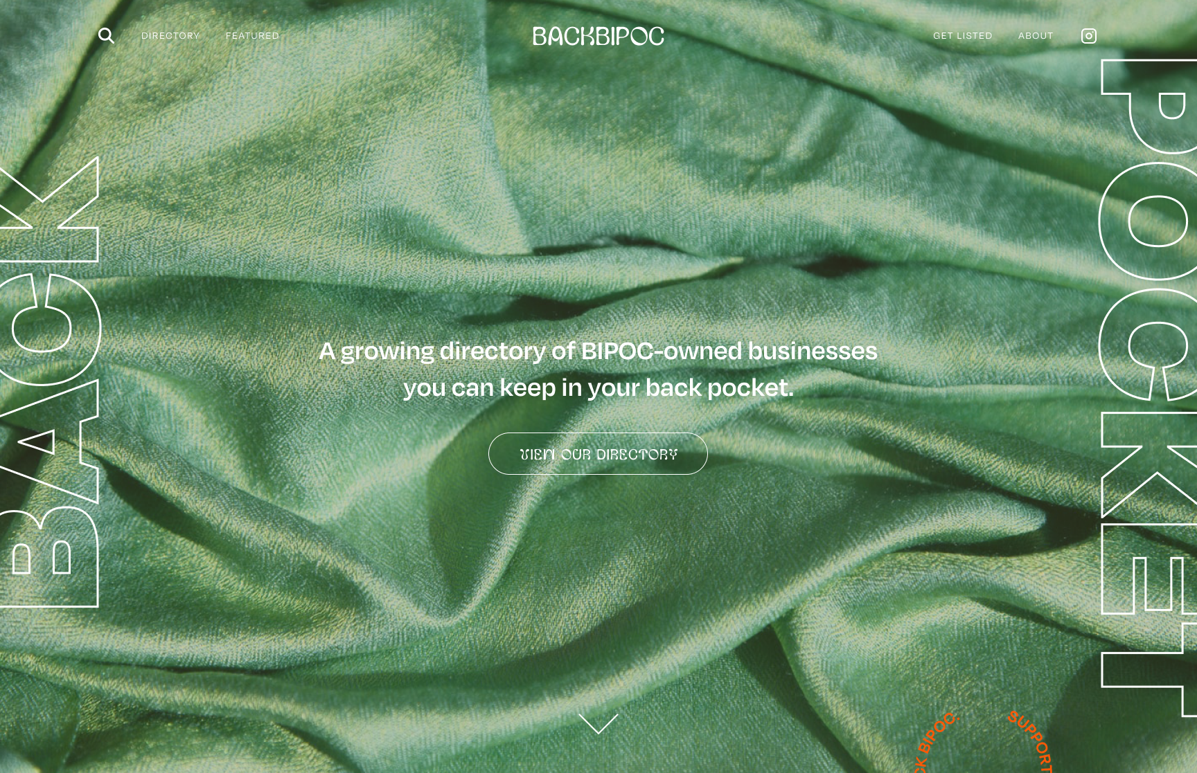
Above the fold on the backbipoc.com homepage.
This section informed a lot of choices used throughout backBIPOC’s visual identity from the very beginning:
The full photo background was the first thing I dropped into the original design plan, and its greens inspired the specific hues I’d use in the brand color scheme. And the large rotated type on each side of the screen, just ever so slightly cut off past the margins, showed how bold typography would be used with otherwise quite simple and more muted motifs.
Categories section
The categories section on the homepage is by far my most asked-about web design element I’ve ever done. It’s my personal favorite too, so there was no way I was going to leave it behind for the site refresh.
The new version however features a fun new element that was the beginning of using Squarespace 7.1 features I couldn’t use on the old site: a gradient orb that follows your cursor, using Squarespace’s native Section Background Art feature.
A tutorial on how to do this image on hover effect is coming soon 👀
Knowing I had to keep these sections in, I started building out the rest of the homepage and the rest of the site around them.
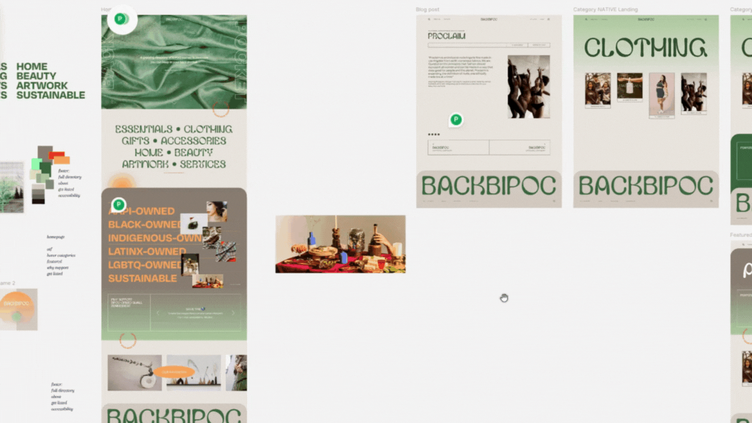
Scaling in mind
One of the things I was dealing with before backBIPOC’s hiatus was how it would require a lot of extra design and coding work every time I needed to create a new featured section or category, such as AAPI-Owned, Black-Owned, and more — especially for cultural heritage and diversity months like Pride Month or Hispanic Heritage Month. It was super important to me to have those featured categories naturally built in to the site, so they’d become a prominent part of the site that would also be automatically updated with each blog post.
I ended up using Squarespace’s portfolio pages for these featured sections, and each featured category has a landing page listing AAPI-Owned, Black-Owned, Indigenous-Owned, Latinx-Owned, LGBT-Owned, and Sustainable businesses.
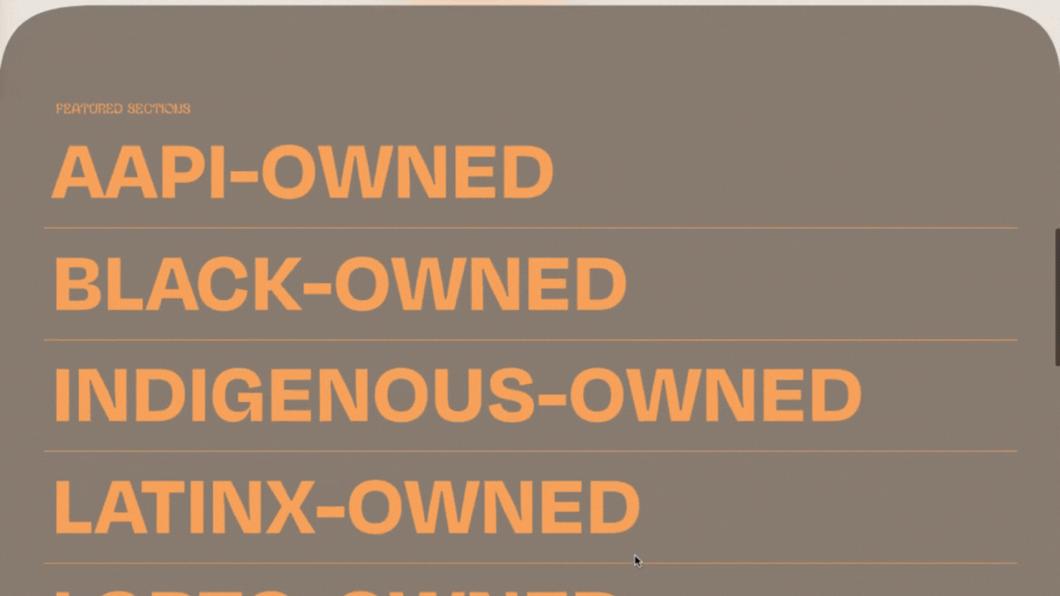
The category list section on the homepage takes you to different Featured Category pages.
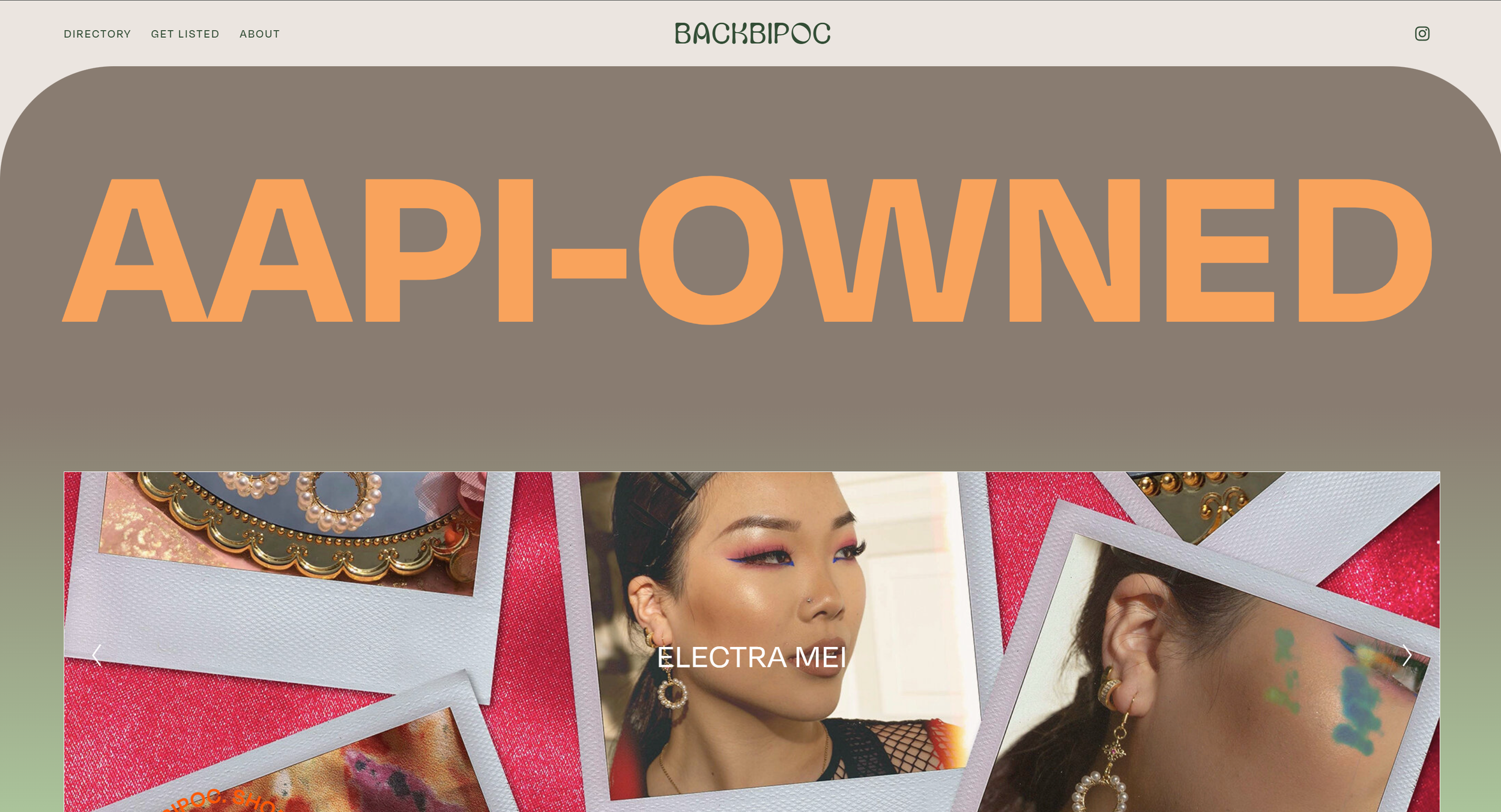
The header of each Featured Category page uses the same styling as the category list section on the homepage.
Colors with intention
As I continued posting on the backBIPOC Instagram and adding more brand features, the original 3-color scheme started to be limiting.

The backBIPOC redesign was updated with a darker green to meet WCAG AAA standards for small text.
Previously, the backBIPOC brand colors featured a warm beige as the main color and a bright orange as an accent color. I still wanted to keep those colors in the visual identity of the brand refresh, but I softened them up a little to a soft orange and a cooler-toned cream to make the full colors easier on the eyes and prevent clashing with the mix of featured brands' photos.
The original backBIPOC dark green was also darkened up to meet WCAG color contrast guidelines when used as body text to help with accessibility!

You'll still see the original bright orange as an accent on the new site, like in this circular text that was also a design element on the original backBIPOC website.
Designing for convenience
Another task that once took more time than it should’ve was having to link the website and Instagram account of every single featured brand. (This doesn’t seem like it takes long, but it’s another thing to have to do after searching through a ton of brand photos, writing each post, and laying out each blog post!)
Now, each post has its own “header” bar, using HTML code put together by a text parser using Zapier automations that take the links from the form brands use to submit themselves to the directory (she’s a woman in STEM, y’all! 💅).
This header bar also features the blog post tags, which makes it easier for readers to look through the directory’s sub-categories.
This section uses a Squarespace code block with HTML put together by Zapier automations (no AI used!)
I’m sure I’ll eventually find another “road bump” as backBIPOC lives on, but for now I’m so happy with the redesign of backBIPOC, both on the brand side and the website side.
I also absolutely wouldn’t have been able to develop so many of these ideas without the knowledge I learned from both the ilovecreatives Squarespace Design Course and the Squarestylist Standout Squarespace course. If you enroll in the ilovecreatives course, let them know you learned about it from me! To access a free workshop from Squarestylist, click on this affiliate link.
If you want to hire LARO Studio for a web build or brand design, head over to our contact page so we can start chatting!